2005-11-27

Magic Del.icio.us JSON feeds

Blogger really doesn't lend itself well to deeper discussion through comments. It's one thing keeping the ball rolling when maintaining cross-blog trackback style dialogues; that works, but relies on both parties keeping a blog. The Blogger comment system is too week for this purpose, in that it

  • does not thread comments.
  • does not offer RSS comment feeds.
  • does not offer any quoting aids.
  • enforces severe limitations on markup.

Of course it's possible to converse without either of the above, but it makes for a rather bad reader experience, and that is one of the things the web medium is usually particularly good at, so I'll try to avoid as much of these pains as I can and hopefully improve the reader value of this conversation. Hence this post; I'm trying out my options. In most relevant aspects, this is more of an open mail (after a lead recap) or news posting, adding one thought set to the mix to move one step ahead in a discussion; we are really only discussing things to do and good ways to do them, so far.

And for those who have not followed this discussion thread at Freshblog, where Greg Hill has posted a good tutorial on how to add Del.icio.us tag navigation to a blog (and not only Blogger blog, I might add), here is an executive summary of what has happened so far in the story:
  1. Greg Hill makes a really spiffy (and very tastefully template integrated, I might add) category navigation system for some of his blogs (Vent, Speccy). It's based on Del.icio.us tags and the Del.icio.us JSON feeds, which enable any web site anywhere to programmatically integrate public tagged bookmarks from Del.icio.us into their sites in any fashion they well please.

  2. Freshblog (which keeps the temperature on, among other things, blog tech development in general and Blogger blog tech development in particular) reports on Marc Morales having published about how he, borrowing ideas from Greg's implementation, made a Del.icio.us based category sidebar for his blog.

  3. Greg, further inspired by Marc's efforts, takes the concept a bit further still, and stops by John at Freshblog to show and explain his improvements in a comment to the prior announcement post.

  4. I stumble by, suggesting Greg would start a tech blog, and then quickly dig into Greg's code to play with a few ideas and get a feel for what I would like to do myself.

  5. Attention strays when I start researching making some base post tagging tools I miss, before being comfortable with this system. (I take some pride in affording myself to enjoy being a rather lazy person, by way of making support tools.)

  6. Meanwhile, Greg types up his tutorial (for Freshblog) on not only adding above mentioned category navigation, but also lots of other nifty side effects, such as integrating this tag navigation panel with google searches or previous tags based navigation on a referring blog, and other goodies.

  7. I play a bit with the code to end up with this blog's tag navigation, and we dive into the above mentioned comment feedback race in the tutorial post, trying to forward the ideas that invariably creep up when creative minds meet around prospects. Worth mentioning is that Stephen of Singpolyma tosses in some idea material and thoughts to the mix as well; this isn't really a dialogue, but more of an eager chattering around a good chunk of geek candy. (We thrive on this kind of thing.)

  8. This post picks up the ball where we leave off, after another round of Greg's much appreciated query firing. If you made it this far without strying off picking up bits of the story elsewhere, you don't really need to, either; I'm quoting the bits I address. Those I leave (mailing list style) are aspects I have little insight into, but which others would be very welcome to pick up on in posts of their own. I believe you could trackback to Freshblog, or just link back here or to Greg's future tech blog (here's hoping... ;-). Leaving comments is of course very welcome too, but dig in any deeper, and you will probably find it about as lacking as I do.

  9. My last post suggested splicing in entire posts by means of AJAX into a list of posts you bring forth by choosing a tag might be both somewhat difficult to achieve (albeit doable), and be less robust than relying on time tested hypertext links, in response to some discussion between Greg and Stephen about inlining more post markup than Stephen presently does.

Johan, you don't need to feel ashamed for playing around with this sort of stuff for the fun of it - that is the essence of hackery!

My concern isn't really about the hackery of it, but rather about having a stable and reader friendly environment for "idea exchange" kind of posts, and a somewhat wilder playground for showing off and testing the forefront of browser technology, pushing at the limits of what javascript and modern browsers can do at any one time. I might evolve towards something like that, over time. (But now I'm on far out on a tangent.)

RE: AJAX. I'm only dimly aware of this, but I think anything that makes for a better user experience is good. But I do think there's a lot of value to be had in getting the most out of URLs, referrers etc (and also seeing them in your logs), so it's probably a trade-off between convenience for users and anticipating what they want.

Improving the user experience is always a good thing. Maybe this is just one of these things that needs playing with before one can tell what constitutes improvement, and what just adds additional network traffic and surprising (generally risky business in user interface design) results. Worth considering is also bookmark semantics, and how the user perceives what constitutes the present page. Click a permalink, and the page you get to is good for bookmarking. Unfold an article or a few, and the same might not hold.

Much can be done by pouring in work to address issues like this, if one sets one's mind to it, but it's also always worth questioning your reasoning first. Doing it for fun? Go ahead. If we do it for the user, though, we might actually end up making it harder for real world users even though we meet the demands of our perceived user.

Re: prompt. The earlier version of this did have a "select category" or similar default statement. Maybe that should return in the next release (as a parameter).

Re: Fade Anything Technique. I like! It certainly emphasises that a change has been made. Again, a parameter to select the highlight colour should be passed.

Request for Advice: when doing this kind of scripting, am I better off passing parameters to the js functions (like the height/width info), or is it better code to use global variables (like del_user and anchor)?

I figure that the number of parameters/options will grow, and I'd like some guidelines on making them global variables or passed parameters or something else.

When dealing with a multitude of parameters, all optional, I tend to toss them up into one big parameter object, which is good because you can read the function call and see what each parameter does, without having to peek at the docs for or code of the function itself, unless you want to add something not already there. An example:
write_tags( { header:"Pick a category:", add_link:false,
onclick_cb:goto, tag_name_cb:expand_camelcase } );

function goto( delitag, option )
{
if( delitag && delitag.u )
location = delitag.u;
}

function expand_camelcase( tagname, option )
{
tagname = tagname.replace( /([A-Z0-9])([^A-Z0-9]+)/g, split_words );
return tagname.substr( 1 ).toLowerCase();
}

function split_words( match )
{
return ' ' + match[0];
}


My thinking is that the above would write out the normal search field, not write the blogger category link afterward (it might be something the user would want to control herself using some callback invoked when the select box changes focus, for instamce), and that tags would be listed differently in the select box than their names ("BlogTech" being shown as "blog tech", for instance).

Passing the relevant Delicios.tags and the <option> node to these callbacks, when given, might not be an ideal API, but it seems useful. I suppose I ought to peek through your present code, and toy with it as I did with the other one. It was fun too, after all. :-)

You might want to add the option of removing the anchor tag from the list, too; I find it a bit useless, at least in my own blog.

Lastly, here's a thought I had about category integration across blogs: "tag piggybacking". Ie the publisher can select another delicious account (in addition to their own) to augment their tagspace (and hence posts).

Why? Well, when you're just starting out, it might communicate to your readers how you're positioning your content, before you've had a chance to build it up.

Or maybe you'd want to include the tags (or just a subset via anchor tags) of a prominent blogger, work colleague or even a group/shared blog of which you're a member.

It could also be used transiently ie you could have "guest tags" on your blog for a week, to help cross-promote a friend or collaborator. (Perhaps on exchange.)

Certainly. You don't really need to limit the scope to Del.icio.us links being used as category navigation of blogs, even though this serves your above mentioned purposes rather nicely. Instead, I would suggest thinking of this as of syndication in a more generic sense. Consider a JSON bookmark feed another flavour of RSS feed, and the menu opens up additional possibilities.

I'm planning on eventually picking up my feed of CommentBlogging bookmarks with the anchor tags , to which I (try to) add every blog comment I write (mycomments) in blogs across the world, which I would not mind also publishing in some panel on my blog (public) and are written in English (eng). I also have a tag for comments I write in Swedish, my native language, which might end up published on my "real life" blog, in said language. For posts I make in response to incoming feedback to my own blog posts, I only occasionally tag a Del.icio.us bookmark, when I feel that the comment would be worth reading for its contents and by a wide public, then using the tag .

This is scheduled to happen when I have figured out how I want it to look. :-) (Things often stall there for me; I don't do much web design per se, even though I take much pleasure from tweaking something half there to become better or more to my taste.)

I guess this would come in two flavours: fully integrated (their tags are entirely rolled in with yours, producing a virtual "super user"); and demarcated (separate lists, counts, labels etc).

While it may drive traffic away from your site, it could also make your blog richer and more useful hence gain you traffic. And, much like linking/blogrolls etc, what comes around goes around.

If it adds value to your blog and is relevant to your reader base, it's of course a Good (possibly Great) Thing; I won't challenge that. For blogs using the Del.icio.us for categories and/or other navigation, this could even be used to make really good interactively foldable blog rolls, where you could catch a quick glimpse on what goes on in your list of recommended reading without even leaving your own site.

If that was vague, let me clarify, picking up on other plans of mine for this site. I will eventually join the crowd and add some kind of peer links, suggesting other good reading on subjects I address, linking Freshblog, Singpolyma, Browservulsel and a few others too for the mutual benefit of tying in relevant content, knitting a tighter community, and all the other beneficial things about useful blog rolls. In linking to Freshblog, which uses Del.icio.us tags, I could add a little "unfold +" before the name, which might pop up a tree of a few recent post titles, show a tag cloud for Freshblogs' ten or twenty most frequently used tags, or similar, to convey an instant feel of whether the reader would find it worth her while going there for a browse, or perhaps subscription, while at it.

Another thing we can do with both our own and the tags from our syndicated peers, is to provide (link only, or abridged version at best, so far) RSS feeds by category. People coming to my own blog only because they are interested in what development I do on Book Burro could subscribe to the Del.icio.us provided RSS feed covering my bookmark category ecmanaut+BookBurro, which could be made available with a quick sleight of hand directly from the tags browser, similar to the Del.icio.us link we already have.

We have only started tapping the possibilities opened up by JSON feeds yet; there is so much that can be done, and Del.icio.us leverages this even further than any other, more conventional site would. We have much work and play to do here. :-)

(Oh, did I already suggest your starting your own tech blog, by the way, Greg? ;-)
2005-11-26

Simplicity rules. Trust matters.

Technology does not mandate complexity. Many really complex problems have fairly simple solutions, when applying technology to solve them. Most don't, however, and as there is no upper bounds on the complexity of conceivable problems to address, there is also no upper bound on the complexity of technology. Users of technology do not scale along the same principles, though, and we need to recognize this when designing tools made to solve a problem. If the tool seems too complex to grasp, the tool fails, even if it could have solved problem, given a better user.

The beauty of simplicity, an article in the November issue of Fast Company Magazine, addresses this problem, relating it to the success of Google, and changes Philips did to make usability one of the company's strengths on the market. Doing just enough, and no more, is driven as the recipe for success, and I'm willing to agree.

The Google front page minimalism keeps things appearing simple. It does not strain our limited supply of attention by introducing ads (a sure longevity mark of quality, by the way) nor any visible tools, except those used frequently enough to mandate being there. Additions do not enter lightly. While Google is a massive Swiss Army Knife under the hood, the front page does not expose every last tool to pick out the eyes of the majority of visitors who came by for something else. This is the "mostly closed" approach to the army knife, as compared to the "mostly open" approach offered by many competitors not keeping their front porch quite as tidy as Google's.

I find this a very compelling trade-off, but what makes me even happier is when there are hidden entrances everywhere to the tools underneath, for those of us mastering a larger subset of the knife than the parts visibly exposed. Without compromising with the needs and comfort of the many. I'm talking about things like query languages that allow me to look for pages across the web, where "ecmanaut" is part of the page URL, by prefixing inurl: to the query. Or orthogonal approaches, such as moving in through different doors entirely, becoming part of the browser itself, as an even leaner search field at the top of my window, next to the browser menus. More power with a close to zero clutter footprint.

There is always a tradeoff between visual apparrency and hidden functionality, and in the above example I'm tapping into features of the Google advanced search page a mere mortal would rarely look for. The use case isn't large enough to warrant the clutter on the front page, or indeed even showing up on the advanced search page prior to a closer study and clicking-through of that page's select boxes, for that matter. This is good design, when you offer a wide feature set.

What is often even better, is offering a really small feature set, as does the iPod, for instance. It plays music. But in cases where the interface burden is zero or close enough to it, even the iPod goes beyond the trivial wide masses use case, and lets you store other random files on it when you plug it into your computer, as if it was your run of the mill memory stick.

It's important to get a good eye for when it is right and when it is wrong to add a new feature or whole feature set to a tool, product or application. We always walk a thin line between overladen user interfaces and not evolving to match the needs of niches and use cases we could address, when looking forward as visionaries to doing more than we do today.

There are many ways of evading the sharp edges that stick out when we add one more feature to the concoction; I'm quite fond of the self configuring Greasemonkey user script addition I recently did for my publish pinger tool, for instance. It adds buttons for sites you use to send notifications to feed readers and aggregators, but not any others. Silently growing added functionality in only the places where the user is mentally prepared for it, and would obviously benefit from it. And at no configuration cost, either.

This is exactly what makes Google move into the browser toolbar business with such decisive force -- the conventional web adds barriers between sites, and will only let you adapt to user net-wide behaviour through the small looking glass of seeing which page she came from to you, whereas a browser extension, or Greasemonkey user script, sees a larger picture, and thus is able to better leverage functionality fit for the specific needs of the user. Without spilling in to the browsing experience or comfort of any other user.

Living in concert with the browser is both a very large opportunity to do good things and an equally large responsibility not to do bad things. You need lots of trust from your user base to pull it off, and you have to earn that trust. Microsoft tried taking some first steps towards tapping into the possibilities that open up when you start looking at the web as being open to invasive composition, in introducing the concept of Smart Tags with the coming of Windows XP. This would have enabled them or third parties tying into the system to add content or functionality to any page on the web (such as adding context menus to certain links or words), much as the opt-in browser extension Greasemonkey does in Mozilla today. It received some really horrible press, and the public uproar made them abandon the project.

Google have so far not made any visible moves toward this, but has eagerly started to move into as many different fields as can possibly be fit under their corporate mission and vision statements (which is a lot); there is fortunately much on offer that could stand better organization and ease of access. They are wise to be cautious and equally wise to have and value their corporate motto of not being evil. Microsoft did not pull this through, I believe, mostly attributed to their lack of user base trust. I trust Microsoft to do what Microsoft believes they would gain wealth from, but I do not trust Microsoft to value my integrity above their own moneymaking opportunities.

Of course, Google is also a company interested in turning a profit, but they have done a much better job of maintaining at least the image of trustworthiness, when it comes to being trusted to value your interests. Not all feel the way I do about that, of course; there are many who will not touch Google Mail, for not wanting to place their pricacy in Google's hands. The same probably applies to your browsing, and running Google's toolbars, though there has not been nearly as much publicity on that topic yet. This would most likely change, in the event of Google's starting to visibly tap on the added powers of the browser extension.

Greasemonkey is a very interesting middle ground, here, in being a grassroots sort of movement, where any javascript programmer with wits can make customized scripts to do mostly anything to any page or pages on the web. It can tie together information not only from one site from within the browser (as the common web is sandboxed to), but also opens up the possibility of pulling in related content from anywhere else. Book burro does this, showing book prices from other stores when visiting one store (Amazon, for instance) to let you compare and pick a more favourable price elsewhere, without having to do the detective work yourself.

The great strength in Greasemonkey is not only in the technology it offers, but also in the way that it does it -- each of these custom scripts requires the user to opt in, a procedure that is also very easy to do, once the extension is installed. You right click a user script, and pick "Install User Script", which is the first option of the menu for only this particular type of script. No annoying clutter footprint anywhere else, the gate to a whole different layer of web on top of the common web, and an immense opportunity to do new interesting applications that completely dwarf today's "web site mashups".

Greasemonkey is still in its cradle, as a phenomenon. It's very stable and rather mature development wise, and the user interface is getting better with every new release. You are still considered exceptionally front line if you have more than, say, thirty user scripts installed, though; we have about the same situation with User Scripts today as we did with browser bookmarks when the first Internet Explorer was designed, and the Favourites menu was deemed a suitable way of organizing them. (It works marvels for a handful, but loses usability steeply as you aproce dozens.)

Greasemonkey doesn't require you to invoke the scripts you install when visiting pages, though, so while its interface still has tricks to learn and sharp corners to shave down, the impact of scaling up the user interface is still quite low. I'm doing my share to help overcome these issues just by pointing at them, and the criticism is very well received. Development in the open when it works at its best.

On my own front, I'm eagerly pondering the possibilities of the Greasemonkey web-on-top-of-the-web, and have already done my own fair share of further Book Burro development to start the idea flow.

I hold a firm belief in the interconnectedness of all things. Greasemonkey, and other tools like it (Reify Turnabout adds the same kind of functionality to Internet Explorer, and the Opera browser has user scripts natively, though without the ease of installation Greasemonkey offers), empowers us to further this growth exponentially. Anybody anywhere can write the next big thing in site interoperability with no budget to start off from, and without the explicit help of the sites and parties involved. It can be shared with the rest of the world, just as easily and at the same lack of distribution cost -- it's just the matter of spreading the word. Publishing it at userscripts.org does much of that too, in a user scripts community that still has not grown very large.

Just never forget that to do and be any good, you must remember these two aspects: simplicity and trust. Toss either, and you will never take off, nor deserve to. Pay attention to both and strike a chord, finding just the right application, and you will most likely also strike gold. Today I do this for the sheer fun of it; I can not anticipate where this will lead to in a year, or two, or ten. It will probably be an interesting journey, though. And all who want to have front row tickets, too.

2005-11-20

Blogger previous and next date links

It's time for my much sought after post on setting up a Blogger blog with Previous and Next date links. This is one way of doing it, it is not exactly the way my blog does it. (This code is much cleaner, and only does this particular thing. Hence you won't need huge racks of code that probably just break browsers I have not done enough testing with.)

Caveats

Before we begin, note that the present state of the Blogger tags are rather limiting and don't yet make it possible to actually solve this problem all out for post pages, without additional labour on your part (such as manualy maintaining the Previos and Next links in each post's text body -- doable though painful) -- the solution given below gives previous and next date links for your archive pages, not Previous / Next post pages. (They can of course be put on item pages too, but on a busy blogging day with three items posted, both the Previous and Next links will skip over a note or two, jumping straight to the nearest date in either direction.) There, you have been warned, now let's get to it!

Prerequisites

You must make sure your Blogger settings are right, since this method requires you to archive by day. Also, you have to republish the entire blog every time you add a post on a new date, or there will not be any "Next date" links for the days running up to the last post. This is because this solution is based on scanning the Archives secion of your blog for links, comparing the dates between the links available there and the dates of the post visited, to pick out the next and previous dates for the two navigation links. Crude, yet effective. This requires reposting the entire blog, because Blogger would not otherwise add today's archive page link to yesterday's archives section. (And it's either update all posts or just today's. Too bad for us; we'll just have to wait for the extra needless processing of our blog history.) One more thing: by implication, to manage to parse these dates, both your date header and archive date formats must contain all of year, month and date. "Sunday", or "November 20" is not enough.

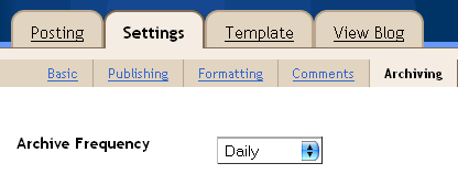
Anyway, find the Archive settings, and set the Archive Frequency to "Daily":

Settings -> Archive -> Archive frequency: Daily


Then it's time to muck about with the template. Pick the Template tab in the view above, mark all contents, copy them and save them in a file somewhere safe. There is no undo button anywhere in sight, so you want to provide you the option, in case you're not satisfied with the results, or something goes very wrong. (I won't be able to help you, so you had better help yourself. I'm only going to say this once.)

Now seek out the <BlogDateHeader> tag; it should be somewhere in the <body> tag, and you might have to scroll through lots and lots of stylesheets before you find it. Mine looked like this before editing:

<BlogDateHeader>
<div class="DateHeader"><$BlogDateHeaderDate$></div>
</BlogDateHeader>

and we will change it a bit to toss in some additions, marked in bold face below:

<BlogDateHeader>
<div style="float:left; visibility:hidden; padding:0.5em;"
id="prev-date"><a accesskey="P">« Previous Date «</a>
</div>
<div style="float:right; visibility:hidden; padding:0.5em;"
id="next-date"><a accesskey="N">» Next Date »</a>
</div>

<div id="seen-date" class="DateHeader"><$BlogDateHeaderDate$></div>
</BlogDateHeader>

The style attributes and order of these tags isn't important; it's just a sketchy way of making them show up somewhat naturally in the page flow; your own styling should hopefully look a little better, to blend in better with the rest of your blog template. If you so prefer, you may skip the added divs and tuck the id and style attributes on to the <a> tags themselves, instead. The accesskey attributes give nice shortcuts to these links; Alt + P/N in most environments, Shift + Escape followed by P or N in Opera. In other Mac browsers, it's Control + P/N.

This adds the basis for where the navigation will end up. As you see, they will be hidden by default -- the mentioned script code will turn them on, when there is something to be clicked for each link. If you always want both links visible, even when unclickable, delete the "visibility:hidden;" part. Should you want just the key bindings, but not the visible links, substitute with "display:none;" instead.

Next, we must make sure the archive section is adressable by the script. Seek out (or add anew, if there is none) the <BloggerArchives> tag. Mine looked like this:

<BloggerArchives>
<a href="<$BlogArchiveURL$>"><$BlogArchiveName$></a> /
</BloggerArchives>

and after our modifications, it will look like this:

<div id="archive"><BloggerArchives>
<a href="<$BlogArchiveURL$>"><$BlogArchiveName$></a> /
</BloggerArchives></div>

The only bit that matters about it is that there is the <a> tag above somewhere in it and that it is surrounded by a tag with the id="archive" attribute. Below this we will add the big portion of code that does the links. Optionally, you may stow all but the leading makePrevNextLinks() line away somewhere up in your <head> tag, if you prefer. Just make sure that the makePrevNextLinks() line appears in the page flow below the above sections, and things will run just fine.

The final blow is the large chunk of code below. Tune it to use your date format (you may want to open up the Settings / Formatting page in a different browser window to find out what date format settings you use, in case you forgot. The two select boxes below need to use the same format (though they won't tell the same date, unless you are one of the few readers who happen to catch this note today, the same day I wrote it), or the code will not work. When you pick a date format, the first two lines of the code below changes accordingly; should you later feel you want to use some other date format, come back here and readjust them to see what values to put there.

Add the huge <script> block -- if you just want it on the archive pages where it always works reliably, encase it in an <ArchivePage>...</ArchivePage> container, and it won't appear on the main page and item pages. If your choice of Date Language isn't English and either of your date formats includes a month name, also be sure to edit the monthNames variable to read exactly (case matters!) how month names are listed in your language of choice, separated by the vertical bar character. Once you are done, save the template and republish your blog, and voilà -- Previous and Next buttons!

Settings -> Formatting -> Date formats


<script type="text/javascript">
var monthNames = 'January|February|March|April|May|June|July|' +
'August|September|October|November|December';
var dateHeaderParser = getDateHeaderParser( 1 );
var archiveParser = getArchiveParser( 9 );
makePrevNextLinks(); // Don't change anything from here onwards:

function makePrevNextLinks()
{
var prevNode = document.getElementById( 'prev-date' );
var seenNode = document.getElementById( 'seen-date' ), seen;
var nextNode = document.getElementById( 'next-date' );
if( !seenNode ) return alert( 'No tag with id="seen-date" found!' );
if( !(seen = dateHeaderParser( seenNode.innerHTML )) )
return alert( 'Failed to parse date "'+ seenNode.innerHTML +
'"; did you really set the right format?' );
seen = seen.getTime();
var all = getDates(), prev, next;
for( next in all )
if( next == seen )
{
next = null;
continue;
}
else if( next > seen )
break;
else if( next < seen )
{
prev = next;
next = null;
}
if( prev && prevNode )
{
if( prevNode.noveName != 'A' )
prevNode = prevNode.getElementsByTagName( 'a' ).item( 0 );
prevNode.href = all[prev];
prevNode.style.visibility = 'visible';
}
if( next && nextNode )
{
if( nextNode.noveName != 'A' )
nextNode = nextNode.getElementsByTagName( 'a' ).item( 0 );
nextNode.href = all[next];
nextNode.style.visibility = 'visible';
}
}

function getDates()
{
var ar = document.getElementById( 'archive' );
if( ar )
{
var all = ar.getElementsByTagName( 'a' ), dates = {}, i;
for( i=0; i<all.length; i++ )
{
var link = all[i];
var date = archiveParser( link.innerHTML );
if( date ) dates[date.getTime()] = link.href;
}
return dates;
}
}

function getArchiveParser( formatNo )
{
var fmt = { 0:'MonthName Day, Year', 1:'MonthNo/Day/Year',
2:'MonthNo\\.Day\\.Year', 3:'YearMonthNoDay',
4:'Day\\.MonthNo\\.Y2', 5:'Year-MonthNo-Day',
/*6:'MonthName Day',*/ 7:'MonthName Day, Year',
8:'Year/MonthNo/Day', 9:'MonthNo/Day/Y2',
10:'Y2_MonthNo_Day', 11:'Day MonthName Year',
12:'Day MonthName', 13:'Day/MonthNo/Year',
14:'Day/MonthNo/Y2' }[ formatNo ];
return fmt ? getDateParser( fmt ) : alert( 'Archive date format type ' +
(formatNo ? formatNo + ' not supported! (Year needed?)' : ' not given!') );
}

function getDateHeaderParser( formatNo )
{
var fmt = { 1:'MonthName Day, Year', 2:'MonthNo/Day/Year',
3:'MonthNo\\.Day\\.Year', 4:'YearMonthNoDay',
14:'Year/MonthNo/Day', 6:'Year-MonthNo-Day',
5:'Day\\.MonthNo\\.Y2', 7:'MonthNo\\.Day\\.Year',
/*8:'Weekday', 10:'MonthName Day',*/
12:'MonthName Day, Year', 18:'Day MonthName Year',
23:'Day MonthName, Year' }[ formatNo ];

return fmt ? getDateParser( fmt ) : alert( 'Date header format type ' +
(formatNo ? formatNo + ' not supported! (Year needed?)' : ' not given!') );
}

function sortNumeric( a, b )
{
return parseInt( a ) - parseInt( b );
}

function findInArray( array, value )
{
for( var i=0; i<array.length; i++ )
if( array[i] == value ) return i;
return -1;
}

function getDateParser( format )
{
var what = { Year:'\\d{4}', Y2:'\\d{2}', MonthName:monthNames,
MonthNo:'\\d{1,2}', Day:'\\d{1,2}' };
var re = format, monthNo = {}, where = {}, order = [], tmp, i, type;
for( i=0, tmp = what.MonthName.split( '|' ); i<tmp.length; i++ )
monthNo[tmp[i]] = i;
for( type in what ) // for each match type,
if( (tmp = format.indexOf( type )) >= 0 ) // if used in this format,
{
where[tmp] = type; // store away its match position, to find out
order[order.length] = parseInt( tmp ); // which paren matched what
re = re.replace( type, '('+ what[type] +')' ); // and fix the regexp
}
for( i=0, order = order.sort( sortNumeric ); i<order.length; i++ )
order[i] = where[order[i]]; // map back to mnemonics, again
var getYear = function( match )
{
var where = findInArray( order, 'Year' ) + 1;
if( where ) return parseInt( match[where], 10 );
where = findInArray( order, 'Y2' ) + 1;
if( !where ) return (new Date).getFullYear();
var year = parseInt( match[where], 10 ) + 1900;
if( year < 1990 ) year += 100;
return year;
};
var getMonth = function( match )
{
var where = findInArray( order, 'MonthName' ) + 1;
if( where ) return monthNo[ match[where] ];
where = findInArray( order, 'MonthNo' ) + 1;
if( where ) return parseInt( match[where], 10 ) - 1;
return (new Date).getMonth();
};
var getDate = function( match )
{
var where = findInArray( order, 'Day' ) + 1;
if( where ) return parseInt( match[where], 10 );
return (new Date).getDate();
};
re = new RegExp( '\\b'+ re +'\\b', 'i' ); // make it a real RegExp
return function( raw )
{
var match = re.exec( raw );
if( match )
return new Date( getYear(match), getMonth(match), getDate(match) );
};
}
</script>

2005-11-19

Greasemonkey indirect link tool

Stay with us after this initial burst of joy: Yay! My first idea blog idea completed! :-) I'm getting kind of happy with the blogger publish helper now; it's shaping up well. And now back to this post.

unzip tab I thought I'd write something about another small Greasemonkey hack I've made some time ago, which has come to feel like part of the browser itself since I started using it -- it's almost the kind of thing I would consider integrating into the status bar as an extension, by now. What it does? It adds a little tab on the top right which reports the number of links in a page that feature an URL encoded as a query string argument (often used by logger pages that do something you don't care much about and then just redirect to somewhere else). When clicked, it drops one such indirection level from all those links.

And if there still are any links like that left (the just decoded link attribute might itself have carried query arguments to some other site), it will pop up a new count. When there are no indirect links left, the bar does not reappear again.

This probably sounded very technical, and in a way it is. In practice, this means that on pages like the search result sets at Google Images, where the images don't actually link straight to the images themselves, but to a frameset, which carries some data about the image dimensions, a links to the page with the image, and some more, the indirection dropper will just change the link to zip past that frameset, bringing you directly to the image itself when you clicked it in the search result set.

It also sort of hints of when you happen to end up in spooky territory; pages with lots of indirect links like these also frequently want to reroute you through bothersome referral programs, throw you off course and generally behave badly. Should you ever end up in porn land, the unzip count often skyrockets due to such linking habits.

Hovering the unzip link also lists the last indirect link on the page in the status bar, as some kind of indication of what they might be about. Before using this, and most of all clicking it to unzip indirect links, you should be aware that this is a destructive modification of the page, which might change the behaviour of links in a manner you had not intended (it certainly changes how things behaved from how the page author had intended them). As seen in the screenshot on top, my blog carries 31 such links; where did they come from? Well, one of them is the map icon, which links to a visitor map for this page -- passing the address here as an indicator of which site's visitors we are curious about. Sixteen of the others are my translate links, who tell Google Language tools to translate the given page to other languages for you, should you want to, and the rest are subscribe links that tell your favourite RSS readers where to pick up my blog feed. When you activate the drop link indirection level user script, all of these links point straight to my site, as that was the URL passed in the query parameter.

But knowing how to use and interpret it, I find it a rather nifty tool. Worth trying.
Categories:

2005-11-18

Google Print in Book Burro 0.17, and future library plans

I had some cheery mail conversation with people on the ClustrMaps team after my recent post on it (as seen in the comments, they were thrilled), and today, after some reflection of mine on interesting future development of an open visitor geocoordinates feed API, Marc (Eisenstadt?) suggested I ought to read up a bit on Jon Udell's writings, had I not already done so. Wow, was he right about that! Thanks a million for the suggestion, Marc; Jon seems about as sold in on the open web and its possibilities as I am, and he certainly also pulls his fair share of community contributions, as interesting hacks goes.

In catching up on some old publicity I seem to have roused, I happened upon another pointer to Jon at David Hall's weblog (Swedish) where David relates my improvements on Book Burro to a screencast by Jon about a Greasemonkey Amazon to library site integration mashup of his. It allows him to see, right on the Amazon page, whether his local library carries each book being browsed, and whether it is available at the moment, or when it will be returned next. He even shows how he adds books to his Amazon watchlist, to get an RSS feed he then somehow again relates to his library (I've got to revisit this when I'm thinking more straight; I'm a bit cross-eyed at the moment -- going to catch some sleep shortly).

The really interesting part, to me, is that Jon seems to have done a good amount of legwork on another longer term project I have had in the pipe since my last visit in the Book Burro code, which would be integrating Book Burro with, not only my local library's availability status of books you browse (in mostly any bookstore, not only at Amazon). My branch of the Book Burro code, since a silent skunkworks release I did two weeks ago now at version 0.17 supports 22 online stores, Google Print and my local library at Linköping University, Sweden.

Yeah, sorry I didn't post about it -- I was thinking about integrating a few other non-commercial projects otherwise similar to Google Print while at it, but my research sort of ended abruptly at having realized that age-old books don't have ISBN:s (the system was not invented 'til last century. No surprise that far. What did surprise me, was that libraries have not in a world-wide joint effort stipulated ISBNs for their stock of pre-ISBN times literature, to be referable everywhere in the same manner everywhere by these great world wide unique identifiers of books. I mean, they all run databases anyway by now, don't they? Were they afraid of running out of ISBN namespace, or something? Surely, they have use some form of unique identifiers in these databases, and wouldn't it have been beautiful if that could have been the ISBNs?

I was somewhat taken aback by this realization, and sort of lost track of scheduling another release, though I did read up on the next system to succeed 10 digit ISBNs -- indeed, the namespace is running short! :-) -- scheduled for January 1, 2007, when the migration period officially starts. It's called ISBN-13, and constitutes a move to EAN codes, which already solve this same problem of slapping a unique identifier for, among other things, price tags on most consumer goods. Which was good enough news to have me completely thrown off track, even though I wrote the code to checksum EANs. (And it's not the silly base eleven ISBN checksums, explaining those funny X characters in some ISBNs of today, either, thank deity.)

But let me get back to Book Burro again. It's really Jesse Andrew's project. We have been meaning to get closer in touch, but haven't quite gotten to doing it yet, to discuss our plans and ideas for the future of it. Coupling our code bases closer together, for one thing, and perhaps making a joint version from which we can build both an extension version (a move Jesse took around version 0.11) and the Greasemonkey code base trail I have furthered myself and integrated with my own addditions besides a contributed 0.11r Reify version for Internet Explorer, which would hopefully (alas, I have not tried this myself) make the script cross browser. With some luck including not only MSIE and Mozilla, but also Opera, which has native user script support. Doing something like that would hopefully mean the best possible outcome for lots of varied user categories, though I have still not heard much as of how the script performs on these different platforms. Maybe my code is no more portable than Jesse's extension, at the moment.

Anyway, my vision on configuring Book Burro for any library anywhere just got a lot closer to reality -- now it is more the question of coming up with decent ways of making a "user interface" for adding your local library to Book Burro's set of link generators, site lookups and parsers, and you should have links from any book in any store to the same book in your library and its status there a quick hack later. I'm even slightly hoping to be able to do it in great style, in a similar fashion to how my Blogger publish ping helper of the past few days does its configuration, by listening in on pages that configures the script just by having seen the URL of a page it has support for adding to its set of buttons.

Because online library catalog systems are fortunately made by a not overly large number of vendors, and probably don't change very much in page -- and most notably URL -- layout, this might be a more than viable solution, listening in to all pages you visit which have the same address structure as that of some known library catalog system. Assuming you visit mostly libraries convenient to your own book consumption, Book Burro could pick up the URL, presumably tie it to the name of the library, or at worst its hostname, and present links to its books, as do the bookmarklets in Jon's LibraryLookup project.

Which is a Very Good Start. I want to move on further still. Jon showed in the mentioned screencast that his Greasemonkey script, like my LiU library lookup script, also checks the availability of a book and presents it directly into the view, right at Amazon. And, for the cases when it isn't in, when it should be back again. (For some reason I didn't add this later feature myself; perhaps LiUB does not show it in their pages, or I had a really sloppy hacking day when implementing the feature. Such excellent features should hopefully not normally go by me unthought of when the opportunity is there.) I find it a very compelling thought indeed to solve this once for the handful of online library catalogs there are (about sixteen, if Jon's pages are any measure), and have the feature for mostly any library anywhere, at the cost of about no user configuration interaction at all, except one normal browser visit to her library after Book Burro installation, when the script silently sets itself up to give her more options the next time she is browsing books in online bookstores.

Not to mention it works the other way too: when browsing your local library, you also get links to book stores everywhere, complete with price tags, so that you might go to the least expensive vendor for your own copy, or perhaps even buy a used copy from one of the auction sites or previously used books stores also covered by Book Burro (in my version, anyway).

I envision a very bright future for browsing for books on the net indeed. I'm really looking forward to experimenting with these online catalogs; for each, I need to find out:
  1. How to search for a book by ISBN (this part is already covered by the LibraryLookup project).

  2. How to find which book (which ISBN) any particular page on the site is about (by URL and/or page content inspection).

  3. When the first copy of a book will be returned to be available again.

  4. How many copies of a book are presently available at the library branch.

The first two are fairly easy, the first in fact even trivial thanks to Jon et al. The third and fourth are in part not very hard either, except for a problem they both share: it can be further complicated by some libraries showing lots of branches in their views, where you would perhaps only be interested in one or a few of these branches, or at least, where you would want them grouped as different entities in the Book Burro book context popup window. "There's one copy at the branch down the street, but that's not in at the moment, but if you catch a ride to the other side of town, you won't have to wait until Friday to find that copy returned, since they have two that are still in." That shouldn't be far off, now.

There might be a need for some amount of manual configuration for that, nonetheless. I still have high hopes for a very untaxing interface that will not require much of the user. If my mother is able to get that script running, showing her books in her local library without asking me for help, I'll be satisfied with the usability of it.

At least until somebody points out how it could become even better.

Google Sitemap pinger

I'm not sure whether this actually does what Improbulus at a consuming experience says it does, notifying Google that your blog was just updated, so I won't update my Blogger publish pinger Greasemonkey script from a day ago or two. It was fun making a page utility of it, none the less. If you have a Blogger blog with the Atom feed turned on in your publishing settings, click here to populate the address field.


Categories:

2005-11-17

Blogger backlinks on main and archive pages too

Whoa. It can be done. But somebody at Blogger needs a spanking. Seriously. Expect a later post with the detailry, or peer at the code in this page, if you feel so inclined.

2005-11-16

Blogger publish ping and categorizer tool

I've done some further updates and improvements to my comment blogging helper Greasemonkey user script announced earlier, and since it has more than doubled in size and I don't seem to get much feedback about whether these tools work or not (perhaps they all do everywhere, though I would be surprised -- I have just tested them in Mozilla 1.5RC2 so far), I opted not to just overwrite the old version.

So, what's new? Well, I wanted to make it easier to ping external sites which track new blog posts using HTTP pings rather than polling your RSS feed once in a while, and so the new version adds ping buttons to the publish page. In this version, it supports Pingoat and Svensk lemonad, quite simply because those were the only ones I remembered off the top of my head (<hint>request features!</hint>).

screenshot


For those of you eager enough to already have taken it out for a spin, here is why it didn't add any buttons -- you have to configure it first. Messy, I know, but there is some thinking behind that too. When you set Pingoat up to ping lots and lots of other sites, there is a point in targeting just sites who apply to your blog. (Or you might be signalling membership in circles you are not part of -- for instance, I believe queerfilter only lists blogs whose authors are not heterosexual. I decided myself on not pinging queerfilter, among others.) First and foremost, though, if you have not installed the script yet, do so.

What you do next is you check the boxes that apply, fill in your blog URL (and optionally feed) and click "Go Pingoat!" -- and lo, at the same time, you also completed the configuration of the publishing ping tool. Because it listens in on your visit to the Pingoat page and configures its Pingoat button to point to this URL. For the blog you configured only. Yep. That wasn't hard, was it?

For Svensk lemonad, a Swedish only site for Swedish geotagged blogs (awfully slim category, I know, but I happen to qualify), there is really only the option of giving a URL to your blog, and it might be argued that such ping sites could be added to all publish pages, regardless of the configuring step? (I am back-tracking my own design thinking now, but bear with me.) That was my first thought, before I had written the code. Because the code happened to become a plugin system which it is very easy to add lots and lots of new buttons to for new ping sites, and it struck me that many of those most likely will apply to very small audiences, such as mentioned lemonade site. So instead of tossing up lots of junk on everybody's publish pages, I decided on this "opt in" kind of system. If you want Svensk lemonad, go there once and set it up, and you will get the button. If not, don't, and you won't see the thing.

So far, so good. So, what happens when you click one of these buttons? Well, the ping page is loaded. Only not in a way that loses the publish page -- it's done in the background, and the icon will slowly pulse while the page is being fetched. When the pulsing stops, it's finished (and hovering the image will tell you how it went). But you don't really have to hover it to know, because if it failed, the flashing will stop at a semi-transparent button, whereas it will be fully solid if it was successful. Typically you will only see it go from solid to transparent to solid once before it's done, but don't be disappointed. You'll get to see it again next time you post. ;-)

If you really want to see the results, though, you can open the link in a new window or tab, but I would suggest not clicking on the button first, because then both the helper and the new frame will perform the ping, and at least pingoat will only report its results on the first click (telling you to wait for a while before pinging again on the second click -- and a healthy design choice too, if you ask me).

That's pretty much that. This article would probably be a lot more selling if it also explained what the ping protocol does, is, and how this would benefit your blog's visibility, but I don't have any pointers handy. Oh yeah, almost forgot. There are keyboard access keys added too; you see them marked with underlines for the text links, and get mouseover hints for the buttons. I added the same feature for my CommentBlogging user script too (read the full article, if you missed it) while at it; you might want to reinstall, to get Alt+d for adding the tag and Alt+o (on Windows; the qualifier key differs across platforms) to go to the original post from the "comment posted" page. The same keys apply on the publish page as well. Enjoy!

Not quite satisfied with how it came out?

This article only covered how to get the information there, not how to format and/or style it. For those of you not already well versed with Cascading Style Sheets you might want to read my follow-up article on visual layout with CSS.

Feedback

If you value my work on this, feel free to drop me a symbolic donation; it would mean a lot to me (but don't feel obligued to). Thanks.

On the rel=nofollow splogging deterrent

Splogging is bad. That far we all agree. To some extent, Blogger and several other blog tools / providers try to combat the harm they do to the web experience, and to the Google PageRank metric. This measure of relevance would otherwise be very cheaply influenced for a spam blog wanting to climb the PageRank ladder, just by spamming links to itself in blog comments all over the web. The CAPTCHA word verification used in this blog and many others are one preventive measure, and when that fails, the links the spammers add are tagged with a rel=nofollow attribute which tells Google not to raise the PageRank of the link target when my blog's PageRank otherwise would have. A full stop to link love.

I'm not going to say that rel=nofollow is a bad solution, period, though I agree to a large extent. Not having this damage control, when CAPTCHA fails, would add further to the sploggers' incentive of posting their junk wherever they can, which is of course a bad thing (see, I already firmly decided that we agreed on that, you might recall). I think rel=nofollow has its purpose, but I would also like to share link love where link love is due, and I would like it to be a very easy thing to do -- just a click away in some comment moderation view. Today, Blogger unconditionally adds the rel=nofollow attribute to all links in your comments, providing neither the option not to, nor the tools to manage this on a post by post basis.

It shouldn't be wasted effort writing good comments, tying together relevant links across the web, even though the few humans directly addressed by a comment might follow the links, unaware of the invisible search engine deterrents sprayed across those links.

I'll settle for something which solves this problem for me and other Blogger users who feel the same way I do, and I think I have an embryo of an idea growing, already. In researching unrelated topics (how to inline the post a comment form in your own Blogger page layout at Jasper de Vries' Browservulsel, and also at the Singpolyma technical blog) I happened upon an article about how to edit Blogger comments posted to your blog, post factum -- and not only yours, but all others, too. Interesting. Each comment on your Blogger blog is technically a blog post, just like your own, and can thus be edited in the Blogger post editor, if you have the rights to. Which you do, when the comment is put in your blog.

History falsification issues aside, this is a really good thing. It means not only that you can go back, correct spelling mistakes you did without posting a new comment and removing the old one, or that you can tidy up posts by others, but it also means that we can fix the rel=nofollow issue when we get somre really good links. Because the HTML we get to edit is not the same HTML the commenter wrote when submitting, it is the post-processed HTML that eventually ends up on your blog. I tried, and yes, editing out the rel=nofollow attribute is done in a snap. Works like a charm.

It's not the one click away story in a comments overview I'd like it to be, though. Jasper has made a handy Greasemonkey script to add comment edit links (and if you read the article on how to edit comments, you also know that you could edit your Blogger template to provide these links yourself), which of course helps, but I'm pondering the next generation of precision automation, doing away just with the rel=nofollow attribute at the click of a button, and without loading any other page in doing so (because then it would not just be clickety-clickety-click when you have three good comments on a post, but also lots of waiting and clicking back, rinse, repeat).

I envision a nifty little Greasemonkey hack which tracks down the comments that have links still marked Google hates your guts, and adds a little heart icon (<3) to it, which, when clicked, fires away an XMLHttpRequest behind the scenes that edits this comment, and when it has succeeded, removes the heart from the comment (since there is no more any need to add any link love there). Points for style awarded for pulsating the heart while this is happening behind the scenes.

And, as it happens, I already tried out how that can be done in a previous, less useful hack of mine where I submit images to ImageShack, which is probably done a lot better with their own Firefox context-menu extension. But it was a useful learning experience, nevertheless, and I did write that image pulsation code. :-)

There, I think that pretty much sums it up. And while this would technically qualify for my Some assembly required blog, I wanted to focus a bit more on the discussion side to it, so I'll just post a back referral and a summary there. Feel free to join in; this will be a fun and worthy hack.

2005-11-15

New blog on protoideas

Tonight I started up another blog I've been thinking of for quite a while but didn't want to pollute this blog with -- wild (or just sudden) ideas I'd like to get back to for a quick hack (or a long one), when time or energy allows. A repository of frozen hack inspiration and -thoughts. A gold mine or a junk pile without a match in the charted world; you decide.

I invite you all to Some assembly required. To just ogle, chime in, extend or turn some idea upside down, or even to pick up some project I have not yet ticked off with a solution or implementation and hack at it yourself, hopefully leaving some note about your results. Either way, you are all most welcome!
Categories:

Clustrmaps: an inkblotch a visitor

When I started this blog, I wanted to reach more people around the world than I had before -- that is why there is some crude support for automated machine translation of the contents in the sidebar panel on the right too -- and as an equally crude way of measuring my reach, I added the visitor map you might also have noticed a bit further down in the sidebar. It adds a red dot for every visitor on the featured map of the earth. (And before my verbal excesses taint your impression from the headline too much, I use the word "blotch" in an affectionate, rather than derogative manner. They're just kind of large for being mere dots. ;-)

Or, well, sort of, anyway; I think they are called "clustrs" and are, intentionally or not, rather big blotches than dots. The service is provided for free for smaller blogs like my own by ClustrMaps, and, the site claiming it is still in beta I thought I'd take this opportunity to both show what I did to get my own ClustrMaps look and feel, and to suggest minor improvements (the web should be about creativity!). But tutorial first, suggestions later.

When you sign up for a free (they are, if you get less than a thousand visitors a day, anyway; let's say I qualify with a margin at this time of writing) account, you get a snippet of HTML code to paste into your site template, and doing so will eventually yield you a nice image, growing slightly redder by the day (assuming you don't set the archive period to reset every day, anyway). Mine looks like this today (site visitors can of course see this for themselves, but this one is dedicated to RSS feed subscribers):

Clustrmap for 2005-11-15

Hover above it (the one in the sidebar) with the mouse, and a much larger, more detailed map will appear. This bit does not come with the basic package, but if you click the image, you will see the big map in your version too, featuring your own visitors. ClustrMaps look up the IP address of your visitors at the same time as they serve them the map image. They then take their time to track down the IP address to a rough geographic location, and finally jot it down on tomorrow's version of the map. Presto!


If you also want the more accessible version of the big map, feel free to borrow my code. Add this snippet of HTML, right after the ClustrMaps HTML blob, for instance:

<script type="text/javascript">
function clustrmaps()
{
var url = 'http://clustrmaps.com/stats/maps-clusters/';
var map = document.getElementById( 'clustrMapsLink' );
var img = (map.all || map.getElementsByTagName( 'img' ))[0];
var end = '-world.jpg';
var dim = { w:800, h:340 };
var get = /url(=|%3D)[^:]*:\/\/([^&]+)*/i;
var big = document.createElement( 'div' );
document.body.appendChild( big );
big.style.display = 'none';
big.style.position = 'absolute';
big.style.height = dim.h+'px';
big.style.width = dim.w+'px';
map.onmouseout = function(){ big.style.display = 'none'; };
map.onmouseover = function()
{
var link = get.exec( map.href )[2].replace( /\//g, '-' );
var me = url + link + end;
var at = getScreenCoordinates( img );
var w = screen.innerWidth || document.body.clientWidth;
big.style.border = '1px outset #888';
big.style.top = (at.y - dim.h - 18) + 'px';
big.style.left = parseInt((w - dim.w)/2 - 1) + 'px';
big.style.background = '#1E1E50 url('+ me +') no-repeat 0 -22px';
big.style.display = 'block';
};
}

function getScreenCoordinates( node )
{
var x = node.offsetLeft;
var y = node.offsetTop;
while( (node = node.offsetParent) )
{
x += node.offsetLeft;
y += node.offsetTop;
}
return { x:x, y:y };
}

var then = window.onload || function(){};
window.onload = function(){ clustrmaps(); then(); };
</script>


world mapThis will load the big map when hovering the image (and no sooner; we wouldn't want to bother neither visitor nor ClustrMaps with any needless traffic). Not on the first day, though -- ClustrMaps must first generate the first day's traffic picture for you before this comes up anything more than an empty rectangle.

If you followed the link in my sidebar, though, you might also have noticed that there was a version of the large map with smaller clusters. The default page clusters up all visitors within a radius of about eight pixels, whereas in this version, each visitor gets a blob. If you want to link and/or pop up this version of the map, change the url in the <a href=""> portion of the ClustrMaps HTML to read ...clusters=no where it said ...clusters=yes, or the url variable on the first line to point to ...maps-no_clusters/ instead. You're set!

Some suggestionsto ClustrMaps


These inkblotches only look really good for very small volumes of traffic; peeking at your own traffic archives, the visitor blobs look a lot more like overgrown bacterias happily colonizing a petri dish:


For at least the small thumbnail maps, it would really make sense starting with smaller, say one or three pixel wide minimum size blobs, than the seven pixel wide present minimum size. I would even find a version without the fat black borders useful, and where the first few steps on the scale are just one pixel wide, with growing redness intensity -- compare (the right version is really a downscaled version of the big map):


See how that right one looks strikingly like some authentic console measuring something important at a large world operations headquarters of some sci-fi movie? I think that that's the kind of feeling you want to offer your heavy duty customers.

At least giving the option (it need not be the default; for catching new users, it is probably even a bad idea) of not rendering any cluster blobs larger than the cluster radius -- especially in the thumbnails, would make things not look so bad on sites with much traffic. As it is now, looks actually degrade with increased traffic, rather than the opposite. Which is kind of a shame, because it is a very cool idea otherwise exceptionally well executed.

2005-11-14

Categorizer bugfix

A smallish but nevertheless annoying (if you are bit by it, anyway) bug crept in below my bug detection radar into the blog post categorizer greasemonkey user script I posted the other day -- if you wanted to tag posts with a default tag that was not the name of your blog, you were not able to. Reinstall from the same location as above, and the bug is fixed. Sorry about the noise. New registrars will of course get the fixed version of the script without ever noticing the bug.

I also bugfixed or extended the in the comment blogging user script I posted yesterday somewhat; it did not add links to popup comment windows (I had to add some code to go pick up the page title from the post, since it's not present in the popup version). Same reinstallation procedure.

And while on the topic of bugs, if anyone wondered why the first keywords listed among my categories here ususally is lowercased, it's because you are using Mozilla. I filed a bug on that problem with text-transform:capitalize in bugzilla last night. I even prepared a minimized test case, which, to my surprise, showed the exact opposite behaviour. Two wrongs don't make a right, but I hope the Mozilla devs soon will. Glad if I could help out like this, too.

2005-11-13

Comment Blogging tool for Blogger blogs

As a follow-up to my recent post on comment blogging, after some initial practice at making my Del.icio.us post categorizer helper (which was much harder), here is a Greasemonkey script that automates mycomments tagging (userscripts.org entry) the comments you write to Blogger blogs.

commenting screenshot What happens is that you get an additional "Save at Del.icio.us" link next to your newly created comment, after you have successfully posted it (see the featured screenshot to the right). Clicking that brings you to the Del.icio.us tag page, all fields filled in and ready to just click Save at. The first time you add a comment, you will have to tell the script what your Del.icio.us user name is, and what tag or tags you want to apply to your comments by default. I warmly recommend keeping the "mycomments" as is (since it's becoming a standard), but you might perhaps want to add "public", or something else, too. Remember, these are just the default tags suggested in the tagging form you get to, so just type the tags you are most frequently going to want to have there already when you comment things, so you minimize your typing. You can always drop or add some before finally submitting each comment to Del.icio.us.

Enjoy!

"Yes, of course, certainly!" -- fostering creativity

After a quick link post at Snook, I ended up reading an interesting article about large corporations, creativity, and how to avoid stifling innovation, thus keeping creative people from defecting to start up on their own, perhaps as a competitor (exemplifying with such a scenario at Disney, and comparing with how Google may have a better take on this).

What I found most striking, however, was this passage:

My buddy Tim tells the story of how, as a 16 year old entrepreneur, he and his partner Bant devised a system call "Yes, Of Course, Certainly" for generating new ideas. Let's say Bant comes up with what he thinks is the greatest idea for a new dog food commercial, and starts telling Tim about it. It is Tim's responsibility to let Bant get the idea out, and say nothing but "yes", even if he thinks it's the worst idea he's ever heard. Once the idea is out there, Tim must add something to the idea to make it better ("of course"). And once it's better, Tim and Bant have to figure out how to actually get it done ("certainly"). If it passes the third stage, Tim and Bant are probably looking at an idea that will probably make Purina quite happy. If it doesn't, the worst thing that happened is that Bant received positive reinforcement for sharing his idea, and the two of them spent some time creatively attacking a problem.


Absolutely brilliant. Who cares about the age of a mind that comes up with great, simple ideas like this? Either way, I think I'm going to have to dig up a few people to toss hack ideas back and forth to, under something like these conditions, with a longer plan for eventually working at a company with this built-in with the plumbing. This is how a knowledge worker's professional relationships should look like. I've seen so very much more of the adverse, when devil's advocate minded people shoot down ideas, figuring out ways in which ideas could fail rather than ways they could be made to work.

Which leads me on to how I'm now quite happy with how my previos and next links work in this blog. It will be hell making an article on how it's accomplished, though, for my next part in my ongoing series about how to make calendar navigation for a Blogger blog. Or maybe I'll just have to repackage my parts and focus on how to get things working, rather than describing the mechanics of how it actually works. I'm sure most readers don't really want to know.
Categories:

2005-11-12

Behind tomorrow's com systems

John at Freshblog writes some pensive reflection about where blogs and aggregation might be heading in the future, largely revolving about the conversation around ideas, and more or less tightly woven topic nets, throughout the web. I have dipped my toes into a slew of smaller scale conversation leveraging networks of various sorts, and my own take is that much of what drives these hubs is the interpersonal plethora of feelings, closeness, kinship and other more heart than mind bonds, that build strong, often lasting structures for communicational flow.

Whatever we are approaching, I am certain of only one thing: it will be interesting. Whether it's a sudden landslide or a light trickling is anyone's guess, but I would not be very surprised finding Google somewhere close to where it happens. Parts of it will be technology, and parts of it can never be. The tech parts we can largely bring in on the table, hack at, and come up with ourselves, if we set our minds on it, and the rest is much left to randomness and the very socially apt few who build with minds what engineers build with matter or science. I find both sides equally fascinating, though confess to habitually rather looking in on the scene from the mad scientists' quarters than from other perspectives.

My guess on what lies ahead is we will be seeing increasing cross-pollination between communications systems of diverse natures, bringing IM clients and protocols like Jabber closer to email, news, blog comment posts and the slow but steady flow of blog entries, making a more natural and tangible connection between the different paces, persistence and connectedness. While different media with different rules, limitations and possibilities, they all have human and our needs as a common denominator, and I can't see why they have to remain as often rigidly separated as they are today.

This post can be read very differently. It can -- and not unjustly so -- be found very thin hot air and lofty waving of hands, or rather as very intriguing thoughts and prospects indeed. Again, I sit in both camps, though I can't as easily pick one over the other. I'm immensely fascinated by the possibilities, and equally sceptical about architectural astronauts, or their counterpart in not-strictly-tech hype.

I find it very pleasing to know I can take part in this development and add whatever comes to mind from a small corner of my own part of the web, though. In part because I have witnessed it first hand, when a rather driving friend of mine decided that the state of mp3 metadata was horrible in the days of ID3 (v1, and 1.1 for that matter) and did something about it (and it didn't end up very good, though it changed things, which was lesson enough for me). The feeling of knowing you can do something to bring about change for the better goes a long way when it comes to building our tomorrow, and all the tiny bits that come together in forming it. And let's have lots of fun in doing it, too.

2005-11-11

Greasemonkey ImageShack this! scripts

Last night I made a Greasemonkey tool for making posting images to ImageShack for safe-keeping or external hosting more comfortable. Actually, I mage two; one that uploads inlined images and one that uploads linked images (if the link is also an image -- typically a thumbnail).

Functionally, it works rather well -- install the script (or scripts -- you can run both at the same time, if you like), and from then on until you turn the script off again (click the Greasemonkey icon and uncheck the appropriate script), the images on all new pages loaded will behave slightly differently when clicked. Assuming you chose the inline saver script for instance, and load this page. Everything seems normal. (In itself a bit of a misfeature, which ought to be addressed somehow usability wise.) But if, say, you click the Japanese flag, which usually (okay, I added that bit last night as well, but you get the idea) would have asked Google translate to hand you a machine translated page in Japanese. Now that flag starts flashing, while ImageShack picks it up and stores it on their hard disks. When done, you get a little popup with the resulting URL to copy and store away elsewhere, and then the image will stop flashing and turn ghosted (clicking this image will now perform its usual function again).

What I kind of miss here though, is a way of switching the script back and forth between active and inactive mode, without the fuss of using the Greasemonkey icon and reloading the page afterward. It ought to be resident at all times without doing anything, until I gave some magic command -- an odd keybinding, or perhaps a bookmarklet to trig it into action. Not quite sure what would be best yet. The popup also has to go. What would be a good way of showing the URL? Adding an input field just below the image?

Some visual cues about images being armed to be ImageShacked would also be in order. I just don't feel like interaction design at the moment, so I'm leaving this script in this somewhat sorry state, for the time being. Useful but somewhat bothersome. Feel free to keep playing with the code.

On-demand cross-site javascript

While I am neither firm believer nor much versed in the design patterns camp, they make good, neat vocabular units. It won't become a true lingua franca until enough people in the extended circle (by which I mean the wide public of not very acacemically versed J. Random Hackers) are familiar with them, but I would still encourage reading up on them, at least a little. This post, once I get on with it, will cover some ground on on-demand loading of javascript, which is also the largest common denominator with the ajaxpatterns article I read as inspiration for and background to writing this.

While I believe design patterns by now at least almost are safely out of hype, they were a religious plague a few years ago when present day plagues like AJAX had not yet caught on. I remember reading an article by a frustrated or at least blissfully cynical Jamie Zawinski, probably at gruntle (though I can't seem to find it now), where he patiently explained that design patterns do not make good programmers out of mediocre programmers. The pattern is a concept explained in simple terms, a basic idea, if you will, on how a problem or part of a problem is formulated as a solution, but you won't design high quality software just by having read up on a library of off the shelf patterns. (In case someone would happen to dig up Jamie's article, by the way, you will most likely find that this is my take on the rant, though by all means read Jamies' too -- it was a good read.)

Anyway, the one thing I had expected to find in an article about on-demand javascript but did not find, was a run-down on how to perform cross-domain on-demand loading of javascript code that you have not written yourself. And consequentially, which will not magically plug in with the rest of your pages and find its place somewhere, hooking up with the rest of your code, announcing "I'm live and loaded now!", which is otherwise a very comfy way of writing external modules. In summary: how do we fire an onload callback, once a <script> tag we just added to the document flow has been fetched and parsed?

Nope, you didn't miss it; it wasn't there. I suppose there might have been in the linked Do you want to know more? tutorial article by Thomas Brattli at the end of the page, but that place had unfortunately been defaced by some schmuck who adolescently replaced all content text with 65,000 by 65,000 pixel wide goatse.cx images from web.archive.org and a note deriding Windows IIS security. (I mailed Thomas about it; hopefully he will find the time to restore his site.) Many browsers are known to crash at huge images like that, by the way -- I strongly advise against going there to look for yourself, if you have anything important going in the your browser session (hence my not linking there directly from here).

If we had wanted to load the script from our own domain, we could of course have used XMLHttpRequest, but without that, we are pretty much left to our own devices. As it happens, I stumbled upon one of those devices just that yesterday, in looking for inspiration on how to integrate Del.icio.us JSON feeds for purposes such as making a categories (or tags) side bar, along the lines I touched briefly in yesterday's post. Ma.la (who probably has a better name, but I'm afraid my Japanese isn't what it should be) has made a striking little piece of inginuous code that does just this -- watch this del.icio.us JSON feed dynamic loading demo (usage: type a del.icio.us user name in the input field and click load to add the most recent fifteen bookmarks to the page).

The bold face bits together perform the magic of running the feed_onload callback, once the code has been fetched from Del.icio.us, and the Delicious.posts variable is defined (since that is what you get when you pull in a Del.icio.us JSON feed).

How this magic works? Well, the setup code before the first bold statement (horrible pun, I admit) sets up some scaffolding for a poll loop trying to evaluate a statement 100 times a second until it eventually yields something non-false without throwing an error. A bit smelly, and a bit elegant, both at the same time. (I would have settled for something much less frequent; running every ten milliseconds feels somewhat excessive, but to each their own, I suppose.)

The second bold face statement makes sure the onload callback won't unintentionally get fired again, by deleting the variable the loader is looking for, or else we would get a page growing fifteen new links every ten milliseconds. This code is of course asking for trouble in the event of multithreaded javascript ever happening in browsers, but until then, there is no race condition to fear.

The less dynamic approach I am planning on taking at the moment, only loads the feed once at page load, then writes some code into the page and considers itself done. It does not really qualify as on-demand javascript, but rather multi-source javascript compositioning, which is useful too. I'm talking about loading a Del.icio.us JSON feed on pageload, adding some navigation based on it (such as the categories you see at Greg's Speccy blog, which is implemented just this way), or Yamy 改め Chalice's Del.icio.us sidebar, which lends itself better for an example. (Again, I wish my Japanese was better; it really looks like a good site.)

Chalice simply solves the problem the Web 1.0 way: first include the external script, then your own (in-line or externally, whichever you prefer) which uses the data loaded from the first script. Basic, robust, foolproof. The HTML standard guarantees that both scripts are loaded before they get executed, in document order, and all is fine and dandy.

This will do for a static navigation panel. It works for Greg and it works for Chalice. Personally, though, I'm still curious about the mechanics of dynamic loading, for my later ideas on a dynamic navigation variant, functionally very similar to Greg's, but with unfoldable categories that expand and show links from other categories without reloading the entire page. It's this kind of small AJAXish applications I'm most mirthful playing with, and I'm really looking forward to eventually cracking that nut. What guarantees do browsers offer about the loading and execution order when you inject new script tags into a loaded document? Indeed, what happens when an external script does not load?

It's very hard to track down answers for questions like these by asking Google, and it's not particularly easy by reading standards either -- the W3C HTML standard, for one, is mostly about the "solid state" HTML document approach, and does not address the DOM "one-page HTML application" approach many of us are moving on towards today. Useful pointers to articles on subjects like these are warmly welcome, by the way.