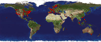
Or, well, sort of, anyway; I think they are called "clustrs" and are, intentionally or not, rather big blotches than dots. The service is provided for free for smaller blogs like my own by ClustrMaps, and, the site claiming it is still in beta I thought I'd take this opportunity to both show what I did to get my own ClustrMaps look and feel, and to suggest minor improvements (the web should be about creativity!). But tutorial first, suggestions later.
When you sign up for a free (they are, if you get less than a thousand visitors a day, anyway; let's say I qualify with a margin at this time of writing) account, you get a snippet of HTML code to paste into your site template, and doing so will eventually yield you a nice image, growing slightly redder by the day (assuming you don't set the archive period to reset every day, anyway). Mine looks like this today (site visitors can of course see this for themselves, but this one is dedicated to RSS feed subscribers):

Hover above it (the one in the sidebar) with the mouse, and a much larger, more detailed map will appear. This bit does not come with the basic package, but if you click the image, you will see the big map in your version too, featuring your own visitors. ClustrMaps look up the IP address of your visitors at the same time as they serve them the map image. They then take their time to track down the IP address to a rough geographic location, and finally jot it down on tomorrow's version of the map. Presto!

If you also want the more accessible version of the big map, feel free to borrow my code. Add this snippet of HTML, right after the ClustrMaps HTML blob, for instance:
<script type="text/javascript">
function clustrmaps()
{
  var url = 'http://clustrmaps.com/stats/maps-clusters/';
  var map = document.getElementById( 'clustrMapsLink' );
  var img = (map.all || map.getElementsByTagName( 'img' ))[0];
  var end = '-world.jpg';
  var dim = { w:800, h:340 };
  var get = /url(=|%3D)[^:]*:\/\/([^&]+)*/i;
  var big = document.createElement( 'div' );
  document.body.appendChild( big );
  big.style.display = 'none';
  big.style.position = 'absolute';
  big.style.height = dim.h+'px';
  big.style.width = dim.w+'px';
  map.onmouseout = function(){ big.style.display = 'none'; };
  map.onmouseover = function()
  {
    var link = get.exec( map.href )[2].replace( /\//g, '-' );
    var me = url + link + end;
    var at = getScreenCoordinates( img );
    var w = screen.innerWidth || document.body.clientWidth;
    big.style.border = '1px outset #888';
    big.style.top = (at.y - dim.h - 18) + 'px';
    big.style.left = parseInt((w - dim.w)/2 - 1) + 'px';
    big.style.background = '#1E1E50 url('+ me +') no-repeat 0 -22px';
    big.style.display = 'block';
  };
}

function getScreenCoordinates( node )
{
  var x = node.offsetLeft;
  var y = node.offsetTop;
  while( (node = node.offsetParent) )
  {
    x += node.offsetLeft;
    y += node.offsetTop;
  }
  return { x:x, y:y };
}

var then = window.onload || function(){};
window.onload = function(){ clustrmaps(); then(); };
</script>
 This will load the big map when hovering the image (and no sooner; we wouldn't want to bother neither visitor nor ClustrMaps with any needless traffic). Not on the first day, though -- ClustrMaps must first generate the first day's traffic picture for you before this comes up anything more than an empty rectangle.
If you followed the link in my sidebar, though, you might also have noticed that there was a version of the large map with smaller clusters. The default page clusters up all visitors within a radius of about eight pixels, whereas in this version, each visitor gets a blob. If you want to link and/or pop up this version of the map, change the url in the
<a href=""> portion of the ClustrMaps HTML to read ...clusters=no where it said ...clusters=yes, or the url variable on the first line to point to ...maps-no_clusters/ instead. You're set!Some suggestionsto ClustrMaps
These inkblotches only look really good for very small volumes of traffic; peeking at your own traffic archives, the visitor blobs look a lot more like overgrown bacterias happily colonizing a petri dish:


For at least the small thumbnail maps, it would really make sense starting with smaller, say one or three pixel wide minimum size blobs, than the seven pixel wide present minimum size. I would even find a version without the fat black borders useful, and where the first few steps on the scale are just one pixel wide, with growing redness intensity -- compare (the right version is really a downscaled version of the big map):


See how that right one looks strikingly like some authentic console measuring something important at a large world operations headquarters of some sci-fi movie? I think that that's the kind of feeling you want to offer your heavy duty customers.
At least giving the option (it need not be the default; for catching new users, it is probably even a bad idea) of not rendering any cluster blobs larger than the cluster radius -- especially in the thumbnails, would make things not look so bad on sites with much traffic. As it is now, looks actually degrade with increased traffic, rather than the opposite. Which is kind of a shame, because it is a very cool idea otherwise exceptionally well executed.
Looks like a potentially useful service, and I agree with your analysis of the need for smaller dots. One thing that I always find amusing about these is that because of the way my ISP addresses me I always show up as Kenya even though I'm not... nothing they can do about this of course, it's just amusing to me.
ReplyDeleteThis is pretty cool. I love the way it pops up on mouseover.
ReplyDeleteI would use it, except that we are already using Frappr and value the ability of fellow Seahawks fans to "shout out".
Great blog, BTW!
Hi guys, the Clustrmaps idea really inspired me to put it on my site. I am very new at this and this is my first weblog. Please visit my site and tell me what needs to improve as I have no idea - I am sure the html is a mess but I have done the best I can! Honesty is the best policy in my opinion! ^_^ Keep up your great work and keep the ideas flowing.
ReplyDeleteGreat Blog!
your script shows error in IE. It works fine in Firefox. But the position of image is shifted a little bit upward in Opera.
ReplyDeleteHi there! I Saw you as one of the wiiners of cluster maps I just wanted to know how v can zoom on the map thanx!
ReplyDeleteI have not been able to reproduce any errors in IE; do you have an URL that shows the problem? Which IE/platform?
ReplyDeleteRegarding the zoomability of some continents of my maps (once visiting the ClustrMaps page), that is a feature they offer for their ClustrMaps+ customers; read more about such features at the ClustrMaps product page.
I love the idea of the mouse-over -- thanks for creating it -- but I too get the error in IE. I think it may not like the java script? (Java & Microsoft don't play well together). I have MSIE 6.0 and my PC is Windows XP. I removed the code because IE would not load the rest of my blog with it in there. I'm guessing that most of my (few) readers also use MSIE, so I cannot rely on people using Firefox or some other browser. Any suggestions?
ReplyDeletePosting another comment, because I had another thought regarding my error in IE. I do NOT get the error on your blog, so I'm guessing that either there's a mistake in the code I tried, or else I don't have it in the right place in the template. Would you be willing to share more of your template's code so we can see where exactly to put it? Thanks!
ReplyDeleteThanks, Mary; that narrowed down the bug enogh for me -- the article is now fixed and the fix is listed on top of the page.
ReplyDeleteHi Johan,
ReplyDeleteI tried your fix, and the error is now gone, but I do not get the large map appearing when I hover over the small map. I tried putting the code in different places around or near the clustrmaps HTML, but none of my manipulations could make it work.
Any ideas? I'll leave the code on my template, if you want to investigate. My blog is: http://marysvirginwool.blogspot.com/.
Thanks,
-Mary
It is important to copy most of the code verbatim; you have happened to end up with a space too much in the
ReplyDeletevar then = window.onload || function(){};expression.That fixed, Johan -- I actually had three extra spaces spread out through that phrase. Thanks so much! It's way cool!
ReplyDelete-Mary
Thanks for your script... I have added it to my blog!
ReplyDeleteDear Mate:
ReplyDeleteI have got a little problem on this, there is no big image coming out. Can you give me a suggestion, please?
Thank you
ziyouau.blogspot.com