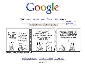
 As I was lazily browsing around userscripts.org this afternoon, I stumbled upon this most amusing Google × Dilbert mashup by Raj Mohan.
Despite being a trade-off between amusement factor and additional clutter, I opted to install it right away, especially as I rarely ever visit the Google homepage these days anyway, with my home browser equipped with the Google toolbar. That fact also made me realize that when I did visit, it was mildly annoying that it was so hard to get strips into context (long arc strips being more the rule than the exception with Dilbert). I figured I would prefer being able to flick back and forth a bit, and as I made a script like that recently for more conveniently browsing Sinfest (userscript.org page), I thought I'd do something similar for this Dilbert hack, but with a bit of ajax for doing it in-place instead of with links, as I did with Sinfest. I'm rather satisfied with the result (direct install link).
Both hacks show the previous / next strip when clicking the left / right portion of the comic. This is, I would deem, the second most intuitive behaviour for any comic browser or image album interface, the most intuitive being just "click anywhere in the image to see the next image". Which is not as useful, though, and as you can see the URLs in your status field as you hover the image and as this script targets the web savvy crowd familiar with user scripts anyway, usability won over discoverability by a comfy margin and I picked the prev/next navigation mode.
I'd like to draw some attention to the fact that while it would have been easier to just add a click event listener to the image, peeking at the coordinates of the click and deciding whether it was in the left or right portion of the image, I went through the trouble of setting up an image map for achieving the effect of "hover to see what will happen on clicking", as we are used to from ages of browser handling experience.
Also, and this is the part where many ajax happy developers foul out, it makes these links behave as links in all respects, allowing those who want to open them in a new tab or window to do so, in the same way they have their browser configured to do it. Shift click, middle click, right-click-and-pick-an-option-in-the-menu, et cetera. You can't do that if you barge on adding event handlers that just do it your way.
Back to the Dilbert hack. As most of the Dilbert strips are three-pane rather than four-pane, as in the case of Sinfest, it struck me it would look neater still having the clickable surface split in three, as that would also allow for a link to the strip itself in the middle. (A bit difficult to share links with others to a strip you liked, if the URL you found it at was http://www.google.com/, see. Most people would probably not understand which particular strip you were referring to, but think you were being obnoxious.) And it seems to work quite well, too.
Enjoy!
Too goddamn cool!! :)
ReplyDelete